GRAPHIC DESIGN PRINCIPALS
Tips for Learning Designers
The following document discusses Graphic Design Principals, and how to apply them in design.
Placement
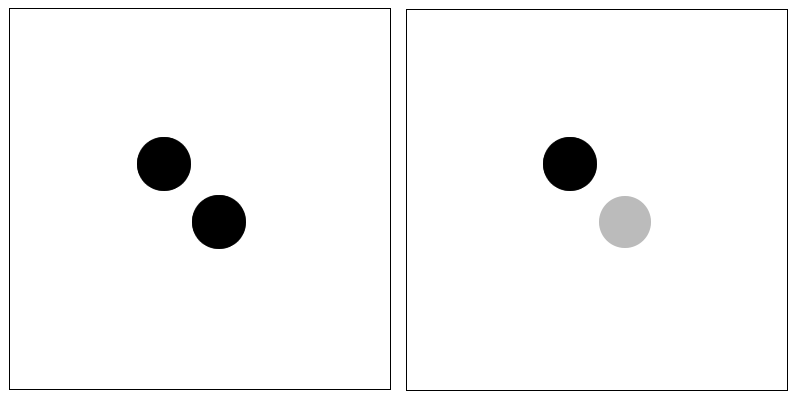
Graphic Design is all about communication, we need to communicate ideas and concepts to people. Graphic Design uses various primitives, as examples points (dots), lines, planes (areas). But where these are placed is very important. Have a quick look at the following two examples of a point on a page. Which point looks like it is sleeping? Which one looks like it is coming down from the sky?
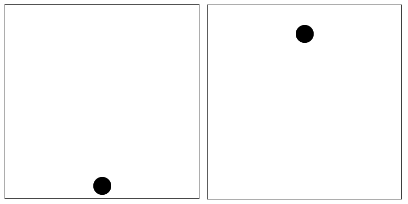
As you can see where you position elements in certain circumstances determines their meaning.
Exercise
Try to create an image using just a dot that represents the following concepts. Give it a go there is no right or wrong answer:
- Afraid,
- Bold or strong
- Fast moving.
Movement
Movement or direction occurs when you can position elements in such a way as they convey the idea that the element is moving from one location to another.
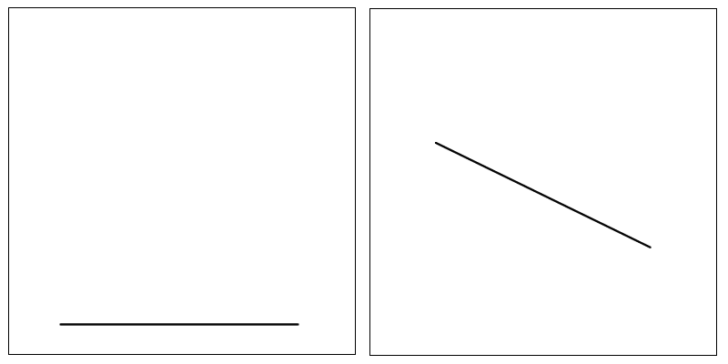
Which of the above lines looks like it is moving? Which direction are they headed.
My thoughts on the second image
I believe that the second image to a Western reader will appear to be moving down from the top left to the bottom right. The reason being we read from left to right. As our eye follows the image, starting at the left, its position, and gravity, tell us it is moving down. An arabic reader who reads from right to left, may percieve the same image to be going up, just a thought (whether true or not I don't know).
Exercise
Have a go at creating a few samples that have movement, and a few that have no movement. Create an image using just a line that to a Western reader will appear to be going up.
Weight
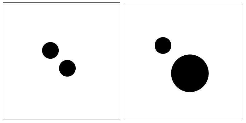
Weight is when an element looks heavier, or more prominent, than another element. Weight can be achieved through the size of the element (larger elements appear to have more weight), or its colour, texture etc. Generally a lighter in colour element appears to have less weight. Darker areas appear to have more weight.
Exercise
Try adjusting the size, or colour of just dots to give weight. Try similar designs with different colours.
Balance
Balance occurs when elements follow a similar pattern, or are aligned, this is called symmetrical balance. Elements are called asymmetrical when they appear to not align they are out of alignment.
Exercise
Try making a few designs that are balanced using any of the principals you have read so far. Then make a few that are unbalanced. One principal that is used often in design is to create a balanced image then just make one portion of it unbalanced, experiment, what does this do to the image? What part of the image now has focus.
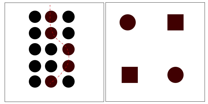
Emphasis
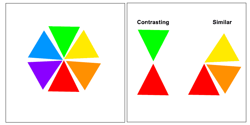
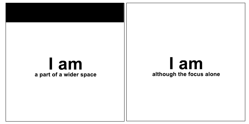
Emphasis is when one part of the composition appears to have more prominence, show up more clearly. This can be achieved through various mechanism, i.e surrounding an area with white space (an empty area), using a different or contrasting colour, using an element in an asymmetrical way to it stands out. The following shows two focal points.
Exercise
Try to create focus using the following principals:
- Surround with white space (colour does not need to be white, just means empty space)
- Use colour to give focus
- Create a balanced design, then move one point off center, the off center point should now have focus.
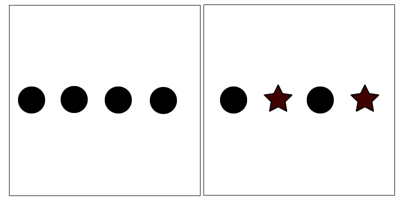
Rythem
Rythem is achieved when a person uses regular intervals (same space between items) or repetition of patterns (repeating of the same shape), or repeating the same direction (it could use different shapes).
Exercise
Create Rythem or chaos through:
- Using regular intervals, i.e same spacing
- Use irregular intervals to position objects
- Use repeated patterns to create unity
- Use a repeated pattern then replace one of them with some thing different what effects can you get?
- Try using the same direction to get unity, experiment with similar and dissimilar (different) shapes.
Unity
Do the items appear to be unified. You can unify items by putting them in a flow, aligning them to a grid, having similar shapes or aligning them with each other.
One principal from nature is that visually pleasing elements use repeated similar shapes but of different sizes.
Exercise
Try creating one of each type of unity:
- Unity of flow
- Unity using a grid
- Unity by aligning elements to each other
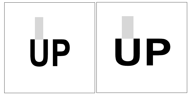
Volume
Is how full or empty a design element is. the following letter u's a have differing volumes. If we were to tip water inside the U it would contain different amounts (volumes). Different volumes give appearance of different weights. The spacing between letters and shapes also has volume.
Exercise
Use a shape and keep its edges the same with, but adjust the volume internally what effects can you get?
Perspective
Does the design move to a vanishing point, or have a 3 dimensional appearance. Does the design give an illusion of depth? Note: Items in the perceived ground of an image are more memorable focused, as we spend our time looking at items in front of us not in the sky.
Exercise
Have a look at some photos that show how light works with perspective, where is it darker, where is it lighter? Now use these principals to fill the back ground of an image to give an impression of depth.
You will notice that things that are further away generally appear lighter, one reason is that they are usually closer to the sun, sun sets show a good example of this.
Which of the following designs look the most natural? Why do you think that is?
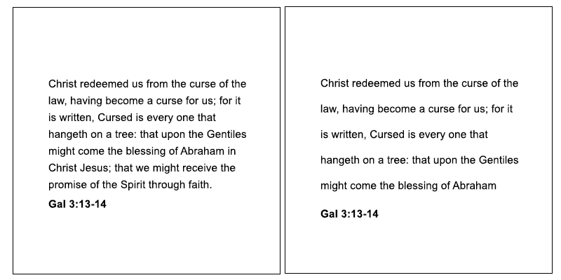
Text Weight
Text can have weight, depending upon how it is spaced. The more space you have between letters either across or down, the lighter it appears. The closer letters are to each other the darker they appear. Using darker or thicker fonts also give greater weight to text blocks. Other ways to modify the weight is to make the column with shorter or longer. Be careful when adjusting column width as extremely small column widths can be too hard to read. The same is true of columns of text that are too long they become hard to read as the eye often comes back to the same line. To solve this problem with long lines of text add more vertical spacing between rows of text. Generally however smaller columns of text are easier to read than long ones, for easy reading break columns of text into smaller columns.
Exercise
Get a block of text, keep it the same font size and weight. Now adjust the spacing between lines, and or, letters, put them side by side, which ones look darker, which ones look lighter.
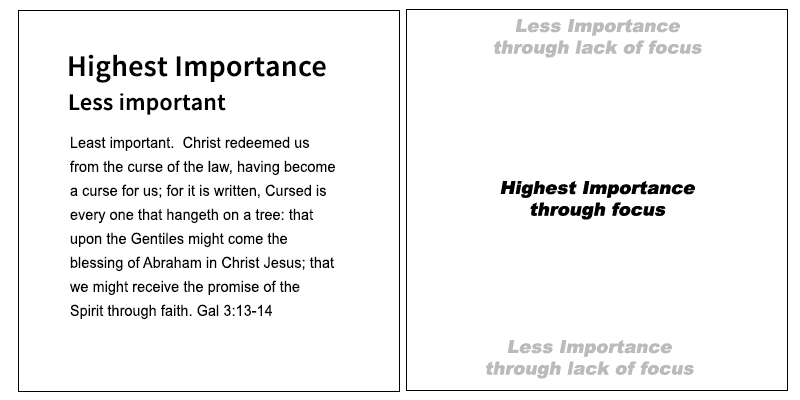
Hierarchy (Importance)
Items in a design can be given importance or hierarchy, the more prominent an item is in the design the more importance it will have as it will be seen first. Giving items importance can be done by increasing the size, or weight of an item, giving it focus etc.
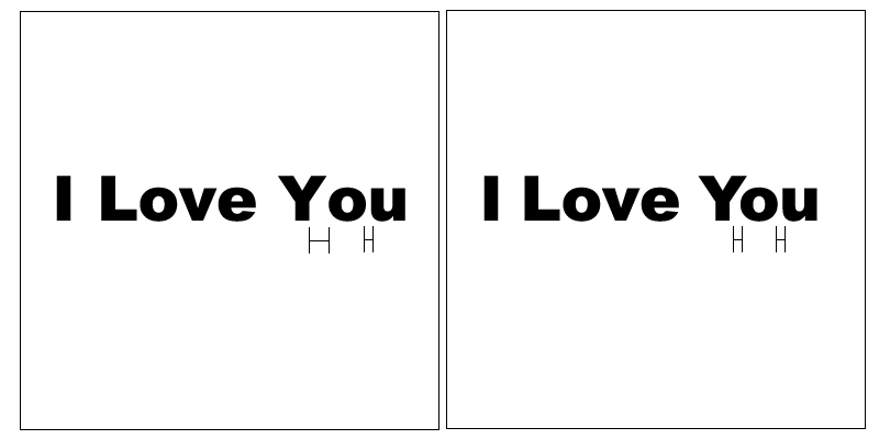
Letter Spacing Differences
Graphics programs often put irregular (different) spacing between letters. In some situations this can be a problem, making the design look unbalanced. To fix this change the letter spacing between individual letters so they have consistent volume between them. Note the example below the first is the default text as placed by the graphics program. The second is the altered text with similar volumes.
Colour Theory
The Colour Wheel
Colour theory revolves around the colour wheel. The colour wheel is a circle with red, yellow, and blue being the primary colours, or the base for all other colours. If you look at the wheel below you will see in-between the blue, yellow, and red, are a mix of the two primary colours. Red and Yellow making orange. Blue and yellow making green. There are two things to notice here:
Colours Beside Each Other look similar to each other so make a good colour combination, they look good together in a design.
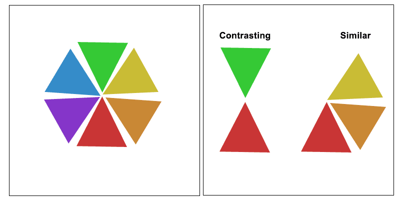
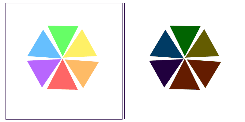
Colours Opposite Each Other contrast or stand out against each other, they are also good together in a design. But the two colours in a way fight against one another, they make each other stand out more. In fact if you look closely they appear to form a black line between each other. If you look at the two colour wheels below you will see the second one is less saturated, has less raw colour. It is clear that the colours on the less saturated wheel look better together. This technique is a key to working with colours that look bad together. Take bright red and green as an example often used at Christmas, it seems way too strong and contrasting, looking awful together, but if we make it less saturated, it actually looks OK together.
A key to selecting colours that look good with each other is to select them at equal intervals around the wheel, i.e. if in thirds, have Equal distance between the three.
Gray Scale added to Colour
Another colour combinations that looks good together is to add Grey to the colour you are using and use parts out of the gradient that is formed.
Gradient
Another way to get a good colour combination is to use a gradient. Select your two colours, then make a gradient between them. Select the middle colour, or colour at equal intervals, and you will have colours that look nice together.
More White or Black Added
Another way to make good colour choices is to use all the principal above but just add more white to the colour (to give a freshness to the colour), or add more black to give sinister tones. Think of a dark night it is scarier, than a bright sunny day. Colour gets feeling by adding brightness or darkness too. The feeling may not be the emotions of fear, and happiness, it could be anything just experiment and see how it feels.
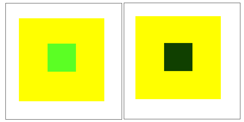
Subtraction
If you take a quick glance at the green dots in the image below you will notice they look slightly different in colour. The reason is that the surrounding colour subtracts colour from the inner dot. The way to describe it is that if a green dot of colour is surrounded by yellow (as an example), the middle dot will appear to have less yellow, so (being originally made of yellow and blue) it will appear very slightly more blue (because yellow has been subtracted). Because green is made up of blue and yellow, when you subtract yellow you get more blue. You can use formulas for this, the previous examples formula would be: B = (B+Y) - Y , that says the colour looks more blue (B), because yellow (Y) has been subtracted from the green (B+Y)
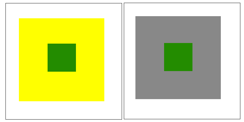
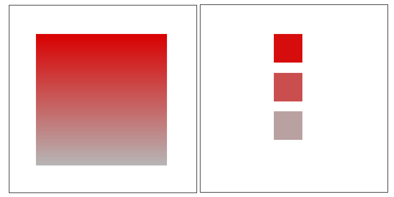
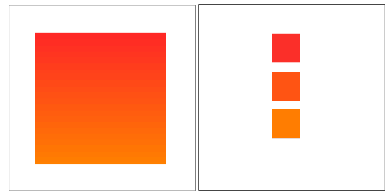
Size and Colour
Deeper (darker) more saturated colours appear larger than lighter less saturated colours. See how the boxes below look different in size even though they use the same sized box.
Squinting to See Composition
A technique used by designers to tell if a design is balanced, and looks good together is to squint, partially close your eyes, and look at the blurry version of the design that your eyes see. You will be able to pick up if it is balanced, and how the colours blur together.
Grids
Use a Grid
Placing an invisible grid in the background of an image/design helps to align elements in a logical way, so they have some order.
Horizontal Lines
Thick Horizontal lines at the top or bottom edge of a design make the contained content appear wider or more spacious. If there are no blocks at top or bottom the design will appear smaller, or constrained.
Vertical Lines
Thick vertical lines (up and down) can be used to hang other items off. If the vertical line is thick enough it will balance the other (hanging) items out.
Focus Through Break from Grid
In a rectangular grid design, try adding a circular or non grid shape to the grid for interest. It will create focus for the elements around it, drawing attention to them.
Psychology
Shape Fear
Sharp shapes trigger dangerous emotions in us, think of safe and unsafe in nature. Pointy things look dangerous.
Triggering Thought Processes
Different images/designs can invoke different thought pathways. A researched example is, a study was done where an image of eyes (watching) people was placed at a counter where donations were being taken, it was found that when people saw the image of the eyes they internally were more fearful that someone is watching them, so they are more likely to give, than if a generic image was displayed. Other examples are, to Chinese black and white represents death, so may be considered bad for a design sent to China. Be aware of culture and people perception of colour etc.
Happy Disorder
Images that are slightly off center, not symmetrical, viewed in perspective, are more appealing than ones aligned in a straight lines.
Rule of Thirds
If you break an image into thirds, objects positioned on the intersecting lines, are generally perceived well.
Curves and Human Form
Smooth shapes are more appealing to the eye than symmetrical ones, also shapes that mimic human form are perceived as more appealing than rigid shapes. Think of the iconic coke bottle, it has a human like shape. On the topic of human form, when modeling people for designs if they are too human like they are perceived less favorably than stylistic representations. Stylistic representations are preferred.
Don't Fill a Design
Although people have a tenancy to fill every bit of white space, it is bad for design, people actually perceive spacious designs as higher in quality. Less is best.
Escape Artist
In line with the principal above of not filling a design, you should have some areas in the design that the person can esacpe to. The eye if feeling uncomfortable with an image or concept needs some where to rest. It is similar to needing to look away in uncomfortable situations. Doing this helps make a design more restful.
Applying this concept to action, could involve adding an image to a large block of text, so when the person gets bored they have something to look at. Or it could be leaving some free space in a design to the person can escape from visual elements.
Golden Shapes
There is a ratio perceived to be golden, or special, as seen in nature, it is a ratio of 0.618. If one side was 100cm, the other side should be 61.8cm. Fibonacci sequences are also perceived favorably, i.e. 1 2 3 5 8 etc. Where the first number is added to the second.
Robert Palmer of Guardian Online Development
Christian Guy and Computer Programmer
Bachelor of Computing
Certificate in Arts
God Works @ work I remember being at church last week and chatting to a friend about how I got into Website design. All the praise goes to Jesus. I used to work many hard manual labor jobs, not that there is anything wrong with that. But I hated the work, I would find myself out in the hot sun, wanting to curse and swear. One day I was driving past Griffith University Campus and saw all the students walking past, and wished I could go there. So I prayed and said to God, "Why do I have all the rotten luck, could you not get me there".
Time went by and I forgot about the prayer. Then some years latter I did a TAFE preparation course to go to university. I applied for many universities, but was accepted by Griffith University to do a Teaching Degree, the very uni I had past as I prayed. God was good to me, I swapped to a Degree in Computer Programming, and have not looked back. The work is great, and I now have a praise to God for my work rather than a curse in my heart. No matter where we are in life, God can promote us, and take us to places we never expected.
 Guardian Online Development