GRAPHIC DESIGN PRINCIPALS IMPROVED BY AI
Tips for Learning Designers
The following document discusses Graphic Design Principals, and how to apply them in design. This article was written with the assistance of AI.
Placement
Graphic Design is all about communication, we need to communicate ideas and concepts to people. Graphic Design uses various primitives, as examples points (dots), lines, planes (areas). But where these are placed is very important. Have a quick look at the following two examples of a point on a page. Which point looks like it is sleeping? Which one looks like it is coming down from the sky?
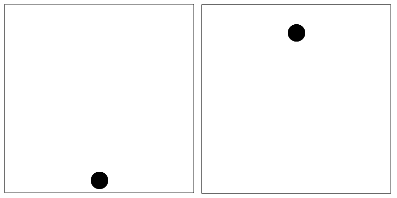
As you can see where you position elements in certain circumstances determines their meaning.
Exercise
Try to create an image using just a dot that represents the following concepts. Give it a go there is no right or wrong answer:
- Afraid,
- Bold or strong
- Fast moving.
Training By AI
In graphic design, the placement of items within a composition can significantly influence the overall meaning, message, and visual impact of the design. Here are several ways in which the placement of items can convey meaning:
1. Hierarchy and Emphasis: The placement of elements can establish a hierarchy of importance within the design. Items positioned prominently, such as at the top or center, are typically perceived as more important or significant than those placed in less prominent locations. This hierarchy helps guide the viewer's eye and emphasizes key messages or focal points.
2. Spatial Relationships: The spatial relationships between elements can convey meaning and evoke certain emotions. For example, grouping elements closely together can create a sense of unity, intimacy, or connection, while spreading them apart can evoke feelings of openness, independence, or isolation.
3. Directional Flow: The placement of items can create a visual flow that guides the viewer's eye through the design in a particular direction. This flow can be achieved through the arrangement of elements such as lines, shapes, or text, as well as through the use of directional cues like arrows or implied movement.
4. Balance and Symmetry: The placement of items plays a crucial role in achieving visual balance and symmetry within a composition. Symmetrical arrangements can convey a sense of stability, order, and formality, while asymmetrical arrangements can create a more dynamic, energetic, or unconventional feel.
5. Context and Meaning: The placement of items within the context of the overall design can enhance or alter their meaning. For example, placing a small icon next to a block of text can visually reinforce the meaning of the text or provide additional context. Similarly, juxtaposing contrasting elements can create tension or irony that adds depth to the design's message.
6. Cultural and Psychological Factors: The placement of items can also be influenced by cultural norms, visual conventions, and psychological principles. For example, in Western cultures, people tend to read from left to right and top to bottom, so designs that follow this reading pattern are often perceived as more intuitive and easy to navigate.
Overall, the placement of items in graphic design is a deliberate and strategic decision that designers make to communicate effectively with their audience. By considering factors such as hierarchy, spatial relationships, directional flow, balance, context, and cultural influences, designers can create designs that resonate with viewers and convey meaning in a clear and impactful way.
Movement
Movement or direction occurs when you can position elements in such a way as they convey the idea that the element is moving from one location to another.
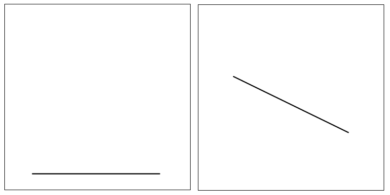
Which of the above lines looks like it is moving? Which direction are they headed.
My thoughts on the second image
I believe that the second image to a Western reader will appear to be moving down from the top left to the bottom right. The reason being we read from left to right. As our eye follows the image, starting at the left, its position, and gravity, tell us it is moving down. An arabic reader who reads from right to left, may percieve the same image to be going up, just a thought (whether true or not I don't know).
Exercise
Have a go at creating a few samples that have movement, and a few that have no movement. Create an image using just a line that to a Western reader will appear to be going up.
Training By AI
Movement in graphic design refers to the visual flow created within a design that guides the viewer's eye from one element to another, creating a sense of dynamism or progression. While physical movement is not possible in a static image, designers use various techniques to imply movement and lead the viewer's eye through the composition.
Here are some techniques designers commonly use to create the illusion of movement in graphic design:
1. Directional Cues: By strategically placing elements such as lines, shapes, or imagery within a composition, designers can create directional cues that lead the viewer's eye in a specific path. Diagonal lines, for example, tend to imply movement and can guide the eye across the design.
2. Flowing Curves: Curved lines and shapes can suggest fluidity and motion, drawing the viewer's eye along their path. Swooping curves or arcs can create a sense of energy and movement within a design.
3. Progressive Repetition: Gradually changing or repeating elements in a sequential manner can imply movement or progression. This could involve a series of images showing incremental changes, or text arranged in a sequence that leads the eye from one point to another.
4. Animation and Motion Graphics: In digital design, animation and motion graphics allow designers to literally animate elements within a composition, creating dynamic movement and engagement. This can include animated transitions, scrolling effects, or interactive elements that respond to user input.
5. Depth and Perspective: By using techniques such as overlapping, scaling, and perspective, designers can create a sense of depth within a design, which can imply movement toward or away from the viewer. This illusion of spatial movement can add visual interest and guide the viewer's eye through the composition.
6. Contrast and Focal Points: Creating contrast between stationary and dynamic elements can draw attention and imply movement. By emphasizing a focal point or key element within the design, designers can create a sense of movement toward or around that focal point.
7. Dynamic Composition: Experimenting with asymmetrical layouts, irregular shapes, and overlapping elements can create a dynamic composition that suggests movement and energy. By breaking away from rigid grid structures, designers can add a sense of spontaneity and movement to their designs.
Overall, movement in graphic design is about creating a visual journey for the viewer, guiding them through the composition in a deliberate and engaging manner. By employing various techniques to imply movement, designers can create designs that feel dynamic, lively, and compelling.
Weight
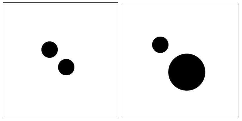
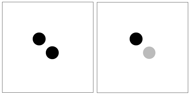
Weight is when an element looks heavier, or more prominent, than another element. Weight can be achieved through the size of the element (larger elements appear to have more weight), or its colour, texture etc. Generally a lighter in colour element appears to have less weight. Darker areas appear to have more weight.
Exercise
Try adjusting the size, or colour of just dots to give weight. Try similar designs with different colours.
Training By AI
In graphic design, "weight" refers to the visual thickness or heaviness of lines, shapes, or text within a composition. Weight is a crucial element that designers manipulate to create hierarchy, emphasis, contrast, and balance in their designs. Here's how weight is used in various aspects of graphic design:
1. Typography: In typography, weight refers to the thickness of a typeface's strokes. Different weights, such as light, regular, bold, or extra bold, can be used to convey hierarchy and emphasis within text. For example, headings or titles may be set in a heavier weight to stand out and grab attention, while body text may be set in a lighter weight for readability.
2. Lines and Borders: In illustrations, diagrams, or graphic elements, the weight of lines and borders can help define shapes, create emphasis, and establish visual hierarchy. Thicker lines are often used to outline important elements or separate sections within a design, while thinner lines may be used for details or decorative purposes.
3. Shapes and Forms: In graphic design, the weight of shapes and forms can influence their visual prominence and impact. Bold, heavy shapes can command attention and create a focal point within a composition, while lighter, more delicate shapes may recede into the background or provide subtle accents.
4. Contrast and Emphasis: Varying the weight of elements within a composition can create contrast and emphasize certain elements over others. By juxtaposing heavy and light elements, designers can draw attention to key points of interest and create visual hierarchy that guides the viewer's eye through the design.
5. Balance and Composition: Weight is also used to achieve balance and harmony within a composition. By distributing visual weight evenly or strategically offsetting heavy elements with lighter ones, designers can create compositions that feel visually stable and aesthetically pleasing.
6. Visual Density: The overall visual weight of a design is influenced by the combined weight of its individual elements. Dense, heavy designs may feel more substantial and impactful, while lighter, more open designs may feel airy and spacious. Designers carefully consider the weight of elements to achieve the desired visual density and mood for their designs.
Overall, the strategic use of weight is essential for creating visually engaging and effective graphic designs. By controlling the thickness and heaviness of lines, shapes, and text, designers can convey hierarchy, emphasis, contrast, and balance, ultimately shaping the overall visual experience for the viewer.
Balance
Balance occurs when elements follow a similar pattern, or are aligned, this is called symmetrical balance. Elements are called asymmetrical when they appear to not align they are out of alignment.
Exercise
Try making a few designs that are balanced using any of the principals you have read so far. Then make a few that are unbalanced. One principal that is used often in design is to create a balanced image then just make one portion of it unbalanced, experiment, what does this do to the image? What part of the image now has focus.
Training By AI
Balance in graphic design refers to the distribution of visual elements within a composition to create a sense of equilibrium and harmony. Achieving balance is crucial for ensuring that a design feels visually stable, cohesive, and aesthetically pleasing. There are several types of balance commonly used in graphic design:
1. Symmetrical Balance: Symmetrical balance occurs when elements are evenly distributed around a central axis or point, creating a mirror image on either side. This type of balance is often associated with formality, order, and stability. Symmetrical designs can convey a sense of harmony and tranquility, making them well-suited for traditional or conservative contexts.
2. Asymmetrical Balance: Asymmetrical balance involves the distribution of visual weight unevenly across a composition, yet still achieving a sense of equilibrium. Unlike symmetrical designs, which rely on exact symmetry, asymmetrical designs use various elements, such as size, color, texture, and position, to create balance through contrast and tension. Asymmetrical balance often feels more dynamic, modern, and expressive, allowing designers to create visually engaging and unconventional compositions.
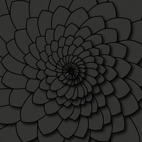
3. Radial Balance: Radial balance occurs when elements radiate outward from a central point, creating a circular or spiral arrangement. This type of balance is common in designs where the central point is emphasized, such as logos, mandalas, or circular layouts. Radial designs often evoke a sense of movement, energy, and unity, drawing the viewer's eye toward the center.
4. Visual Weight: Balance is also achieved by considering the visual weight of elements within a composition. Visual weight is influenced by factors such as size, color, contrast, texture, and position. Heavier or more visually dominant elements exert greater visual weight and need to be balanced by lighter or less dominant elements to maintain equilibrium.
5. Formal Balance: Formal balance refers to a precise, evenly distributed arrangement of elements that creates a sense of stability and order. This type of balance is often used in traditional, conservative designs where symmetry and precision are valued.
6. Informal Balance: Informal balance, also known as dynamic balance, involves a more relaxed and spontaneous arrangement of elements that achieves balance through variation and asymmetry. This type of balance is common in contemporary, artistic, or eclectic designs where creativity and expression are prioritized over strict adherence to symmetry.
Overall, balance is a fundamental principle of graphic design that plays a crucial role in creating visually pleasing and effective compositions. By understanding and applying various techniques of balance, designers can create designs that feel harmonious, cohesive, and engaging to the viewer.
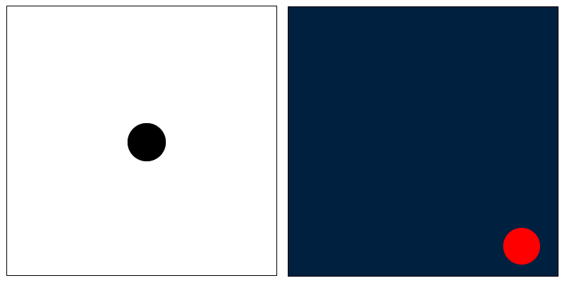
Emphasis
Emphasis is when one part of the composition appears to have more prominence, show up more clearly. This can be achieved through various mechanism, i.e surrounding an area with white space (an empty area), using a different or contrasting colour, using an element in an asymmetrical way to it stands out. The following shows two focal points.
Exercise
Try to create focus using the following principals:
- Surround with white space (colour does not need to be white, just means empty space)
- Use colour to give focus
- Create a balanced design, then move one point off center, the off center point should now have focus.
Training By AI
Emphasis in graphic design refers to the technique of making certain elements stand out and grab the viewer's attention within a composition. It's about creating focal points and directing the viewer's gaze to specific areas of the design to communicate key messages or evoke desired emotions. Here's how emphasis is used in graphic design:
1. Contrast: One of the most common ways to create emphasis is through contrast. By making certain elements visually distinct from others in terms of color, size, shape, texture, or style, designers can draw attention to those elements. For example, using bold colors against a neutral background or placing a large element next to smaller ones can create contrast and emphasize the focal point.
2. Typography: Typography plays a crucial role in creating emphasis within a design. Designers can use different typefaces, font sizes, weights, styles (such as bold, italic, or underlined), and colors to make certain text elements stand out. Headings, subheadings, and important keywords can be emphasized to guide the viewer's reading order and highlight key information.
3. Whitespace: Negative space, or whitespace, can be strategically used to create emphasis by isolating or framing important elements within the design. By surrounding a focal point with ample whitespace, designers can draw attention to it and make it stand out against the surrounding elements.
4. Visual Hierarchy: Establishing a clear visual hierarchy is essential for creating emphasis within a design. By organizing elements based on their importance or significance, designers can guide the viewer's eye through the composition and emphasize key messages. Techniques such as size, position, color, and contrast can be used to establish and reinforce the visual hierarchy.
5. Isolation: Sometimes, simply isolating a particular element from the rest of the composition can create emphasis. Placing a single object or element against a blank background or in an uncluttered area of the design can make it stand out and command attention.
6. Repetition and Variation: Emphasis can also be achieved through repetition and variation. By repeating certain visual elements or motifs throughout the design and then introducing variations or deviations, designers can create focal points and draw attention to specific elements.
7. Visual Effects: Techniques such as shading, gradients, shadows, and other visual effects can be used to create depth, dimension, and emphasis within a design. These effects can help certain elements pop off the page and draw the viewer's eye.
Overall, emphasis is a powerful tool in graphic design for creating focal points, guiding the viewer's attention, and communicating key messages effectively. By strategically applying contrast, typography, whitespace, visual hierarchy, isolation, repetition, and visual effects, designers can create designs that are visually engaging, memorable, and impactful.
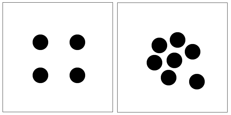
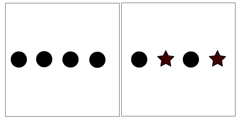
Rythem
Rythem is achieved when a person uses regular intervals (same space between items) or repetition of patterns (repeating of the same shape), or repeating the same direction (it could use different shapes).
Exercise
Create Rythem or chaos through:
- Using regular intervals, i.e same spacing
- Use irregular intervals to position objects
- Use repeated patterns to create unity
- Use a repeated pattern then replace one of them with some thing different what effects can you get?
- Try using the same direction to get unity, experiment with similar and dissimilar (different) shapes.
Training By AI
Rhythm in graphic design refers to the repetition or alternation of visual elements to create a sense of movement, pattern, and harmony within a composition. Just as rhythm is essential in music to establish a tempo or beat, rhythm in graphic design helps guide the viewer's eye through the design and create a sense of flow and continuity. Here's how rhythm is used in graphic design:
1. Repetition: Repetition involves using the same visual element or motif multiple times within a design. By repeating elements such as shapes, colors, lines, or patterns, designers can establish a consistent visual rhythm that unifies the composition. Repetition creates a sense of predictability and familiarity, making the design feel cohesive and organized.
2. Pattern: Patterns are formed through the repetition of elements in a regular, orderly manner. Whether it's a simple grid layout, a complex geometric pattern, or a decorative motif, patterns create visual interest and rhythm within a design. Patterns can be used to fill negative space, add texture, or create a sense of movement and energy.
3. Grid Systems: Grid systems provide a framework for organizing content within a design by dividing the space into columns, rows, and modules. Grids help establish a rhythm by providing a consistent structure for arranging elements and maintaining visual alignment throughout the composition. Grid-based layouts create a sense of order and coherence, making it easier for viewers to navigate the design.
4. Alignment: Aligning elements along a common axis or edge creates a sense of rhythm and visual continuity. Whether it's text aligned along a baseline, images aligned along a grid, or objects aligned along a central axis, alignment helps establish a cohesive rhythm within the design. Consistent alignment creates a sense of order and balance, while deliberate misalignment can add interest and variation.
5. Movement and Flow: Rhythm can also be created through the deliberate arrangement of elements to create a sense of movement and flow within the design. By strategically positioning elements to lead the viewer's eye in a specific direction, designers can establish a rhythm that guides the viewer through the composition in a fluid and dynamic manner.
6. Scale and Proportion: Varying the scale and proportion of elements within a design adds visual interest and creates rhythm. By alternating between large and small elements, designers can create a sense of rhythm and variation that keeps the viewer engaged. Gradually changing the scale or proportion of elements can also create a sense of progression and movement within the design.
Overall, rhythm in graphic design is about creating a sense of order, movement, and continuity through the repetition, pattern, alignment, and flow of visual elements. By establishing a cohesive rhythm, designers can create designs that are visually engaging, harmonious, and easy to navigate.
Unity
Do the items appear to be unified. You can unify items by putting them in a flow, aligning them to a grid, having similar shapes or aligning them with each other.
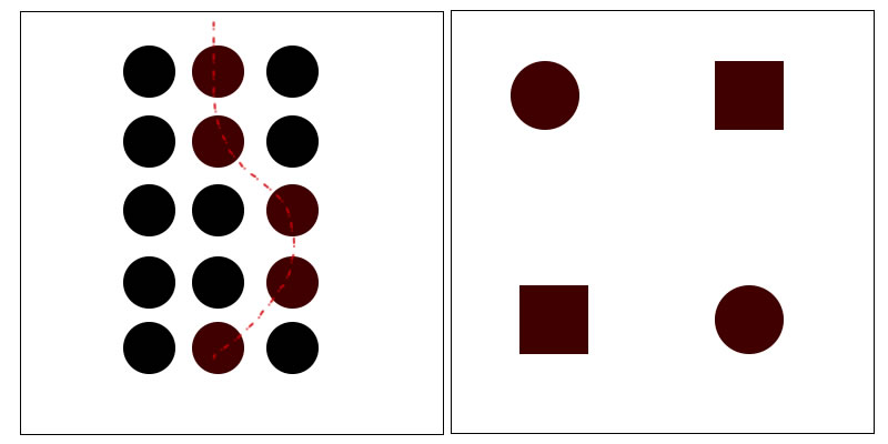
One principal from nature is that visually pleasing elements use repeated similar shapes but of different sizes.
Exercise
Try creating one of each type of unity:
- Unity of flow
- Unity using a grid
- Unity by aligning elements to each other
Training By AI
Unity in graphic design refers to the cohesive integration of all visual elements within a composition to create a harmonious and balanced whole. It's the principle that ensures that all parts of a design work together cohesively to communicate a unified message or concept. Unity is crucial for creating designs that feel organized, coherent, and visually pleasing. Here's how unity is achieved and utilized in graphic design:
1. Consistent Visual Style: Maintaining a consistent visual style throughout a design helps create unity. This includes using the same color palette, typography, imagery, and graphic elements across the entire composition. Consistency in style ensures that all elements feel like they belong together and are part of the same visual language.
2. Repetition of Elements: Repetition of visual elements such as shapes, colors, patterns, or motifs helps create unity within a design. By repeating certain elements throughout the composition, designers establish a sense of coherence and consistency. Repetition also helps reinforce key messages and create visual rhythm.
3. Alignment and Grids: Establishing a strong alignment and grid system helps create unity by organizing elements within the design space. Aligning elements along a common axis or grid helps create order and cohesion, making it easier for viewers to navigate the design. Grid-based layouts ensure that elements are positioned consistently and maintain visual balance.
4. Hierarchy and Focal Points: While unity emphasizes the integration of all elements, it's also important to establish hierarchy and focal points within the design. By prioritizing certain elements and guiding the viewer's attention, designers can create a sense of order without sacrificing visual interest. Unity and hierarchy work together to create designs that are both cohesive and engaging.
5. Negative Space Management: Negative space, or whitespace, plays a crucial role in creating unity within a design. By carefully managing negative space and balancing it with positive elements, designers create a sense of breathing room and clarity. Proper use of negative space ensures that the design feels balanced and unified, without appearing cluttered or overwhelming.
6. Color Harmony: Selecting a harmonious color scheme helps create unity and cohesion within a design. Colors can evoke specific emotions and associations, so choosing colors that complement each other and support the overall message or concept reinforces the sense of unity. Color harmony helps tie together disparate elements and create a cohesive visual experience.
7. Consistent Branding: In branding and identity design, maintaining consistency across all visual touchpoints helps create unity and reinforce brand recognition. Consistent use of logos, colors, typography, and imagery across various applications ensures that all brand elements work together seamlessly to communicate a unified brand identity.
Overall, unity in graphic design is about ensuring that all visual elements come together to form a cohesive and harmonious whole. By maintaining consistency, repetition, alignment, hierarchy, negative space management, color harmony, and consistent branding, designers create designs that are visually appealing, organized, and effective in communicating their intended message or concept.
Volume
Is how full or empty a design element is. the following letter u's a have differing volumes. If we were to tip water inside the U it would contain different amounts (volumes). Different volumes give appearance of different weights. The spacing between letters and shapes also has volume.
Exercise
Use a shape and keep its edges the same with, but adjust the volume internally what effects can you get?
Perspective
Does the design move to a vanishing point, or have a 3 dimensional appearance. Does the design give an illusion of depth? Note: Items in the perceived ground of an image are more memorable focused, as we spend our time looking at items in front of us not in the sky.
Exercise
Have a look at some photos that show how light works with perspective, where is it darker, where is it lighter? Now use these principals to fill the back ground of an image to give an impression of depth.
You will notice that things that are further away generally appear lighter, one reason is that they are usually closer to the sun, sun sets show a good example of this.
Training By AI
Perspective in graphic design refers to the technique of creating the illusion of depth and spatial relationships within a two-dimensional composition. It's a powerful tool that designers use to add realism, dynamism, and visual interest to their designs. Here's how perspective can be used in graphic design:
1. Linear Perspective: Linear perspective is a technique for creating the illusion of depth by using converging lines that recede into the distance toward a vanishing point. In graphic design, linear perspective can be used to create realistic depictions of three-dimensional space, such as architectural renderings, cityscapes, or interior designs. By establishing a horizon line and vanishing points, designers can create the illusion of depth and distance, making the composition feel more immersive and dynamic.
2. Foreshortening: Foreshortening is a technique for depicting objects that are receding into the distance or viewed from an angle. It involves distorting the proportions of objects to create the illusion of depth and perspective. In graphic design, foreshortening can be used to create dynamic and dramatic compositions, particularly in illustrations and character design. By exaggerating perspective and playing with scale, designers can create dynamic compositions that draw the viewer's eye into the scene.
3. Depth Cues: Depth cues are visual cues that suggest depth and distance within a composition. These cues include techniques such as overlapping, size variation, atmospheric perspective, and shading. By incorporating depth cues into their designs, designers can create the illusion of three-dimensional space and depth, even in flat, two-dimensional layouts. Depth cues help establish spatial relationships between elements and create a sense of realism and depth within the composition.
4. Isometric Perspective: Isometric perspective is a type of perspective where all lines remain parallel, resulting in a flat, geometric look without converging lines or vanishing points. In graphic design, isometric perspective is commonly used in illustrations, infographics, and technical drawings. Isometric designs have a clean, minimalist aesthetic and are often used to depict complex systems or environments in a clear and understandable way.
5. Point of View: Perspective also refers to the point of view or viewpoint from which the scene is depicted. By choosing different perspectives, such as bird's-eye view, worm's-eye view, or eye-level view, designers can create different visual experiences and evoke different emotions in the viewer. The choice of perspective can influence how the viewer perceives the scene and the relationships between objects within it.
Overall, perspective is a fundamental principle of graphic design that adds depth, realism, and visual interest to compositions. Whether using linear perspective to create realistic spatial relationships, foreshortening to add drama and dynamism, or depth cues to establish depth and distance, designers use perspective to create immersive and engaging designs that captivate the viewer's imagination.
Text Weight
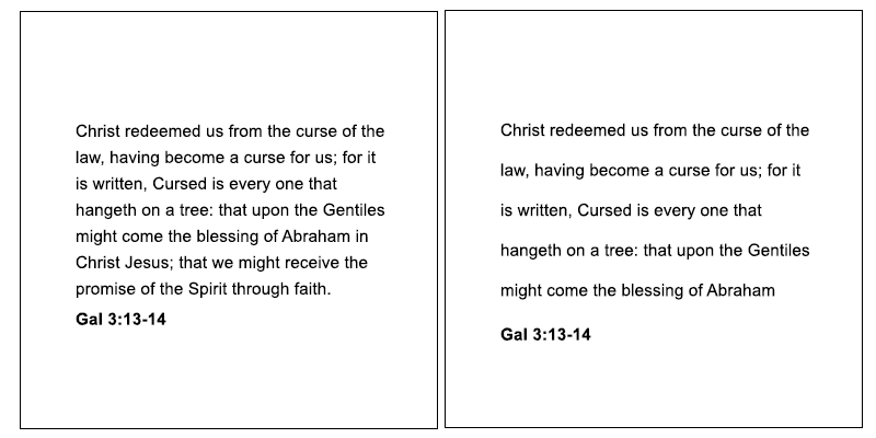
Text can have weight, depending upon how it is spaced. The more space you have between letters either across or down, the lighter it appears. The closer letters are to each other the darker they appear. Using darker or thicker fonts also give greater weight to text blocks. Other ways to modify the weight is to make the column with shorter or longer. Be careful when adjusting column width as extremely small column widths can be too hard to read. The same is true of columns of text that are too long they become hard to read as the eye often comes back to the same line. To solve this problem with long lines of text add more vertical spacing between rows of text. Generally however smaller columns of text are easier to read than long ones, for easy reading break columns of text into smaller columns.
Exercise
Get a block of text, keep it the same font size and weight. Now adjust the spacing between lines, and or, letters, put them side by side, which ones look darker, which ones look lighter.
Training By AI
Text weight in graphic design refers to the thickness or heaviness of the typeface used for textual elements within a design. The choice of text weight can significantly impact the overall look, readability, and hierarchy of the design. Here's how to use text weight effectively in graphic design:
1. Hierarchy and Emphasis: Text weight is crucial for establishing hierarchy and emphasis within a design. By varying the weight of textual elements, such as headings, subheadings, body text, and captions, designers can create a visual hierarchy that guides the viewer's eye through the composition. Typically, heavier weights are used for headings and titles to make them stand out and grab attention, while lighter weights are used for body text to maintain readability.
2. Contrast: Contrast is key to creating visually engaging designs, and text weight is an important tool for achieving contrast. Contrasting text weights help differentiate between different levels of information and create visual interest. For example, pairing a bold headline with lighter body text creates a clear contrast that makes the headline stand out and draws attention to it.
3. Readability: Text weight also plays a crucial role in readability. Heavier weights are generally easier to read at larger sizes and from a distance, making them well-suited for headlines and titles. Lighter weights, on the other hand, are more legible at smaller sizes and for longer passages of text, making them ideal for body copy. When choosing text weight, it's essential to consider the intended size and context of the text to ensure optimal readability.
4. Branding and Identity: Text weight can be used to reinforce a brand's identity and personality. Different weights of the same typeface can convey different characteristics, such as strength, elegance, modernity, or playfulness. By selecting text weights that align with the brand's values and visual identity, designers can create cohesive and memorable brand communications.
5. Consistency: Consistency in text weight helps create a cohesive and unified design. Within a single composition or across multiple design assets, maintaining consistent text weights reinforces visual continuity and establishes a sense of professionalism. Consistent use of text weight also helps establish a clear visual hierarchy and reinforces the importance of different textual elements within the design.
6. Balance: Text weight should be balanced with other visual elements within the design to create a harmonious composition. Heavy text weights can overpower lighter elements if not balanced properly, leading to a visually unbalanced design. By carefully considering the weight of all elements within the composition and ensuring they work together harmoniously, designers can create well-balanced and visually pleasing designs.
Overall, text weight is a powerful tool in graphic design for establishing hierarchy, creating contrast, enhancing readability, reinforcing branding, maintaining consistency, and achieving visual balance. By understanding how to use text weight effectively, designers can create designs that are not only visually appealing but also clear, engaging, and easy to understand.
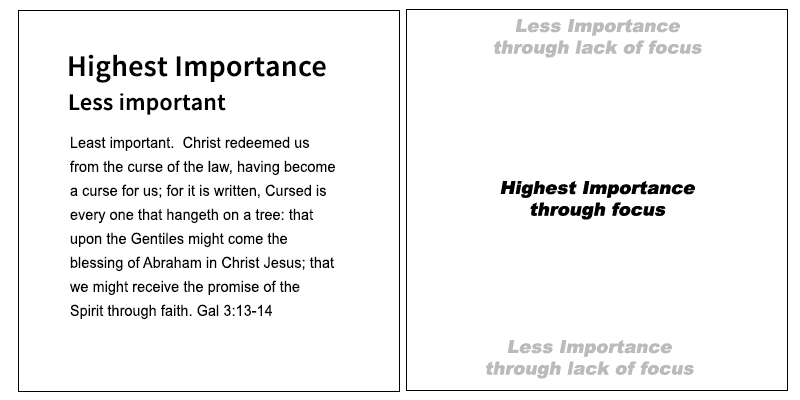
Hierarchy (Importance)
Items in a design can be given importance or hierarchy, the more prominent an item is in the design the more importance it will have as it will be seen first. Giving items importance can be done by increasing the size, or weight of an item, giving it focus etc.
Training By AI
Hierarchy in graphic design refers to the organization and prioritization of visual elements within a composition to guide the viewer's attention and communicate information effectively. Establishing hierarchy is crucial for creating clear and visually engaging designs that convey the intended message or content hierarchy. Here's how to use hierarchy effectively in graphic design:
1. Size: Varying the size of elements is one of the most common and effective ways to establish hierarchy. Larger elements naturally draw more attention and are perceived as more important. Use larger sizes for headlines, titles, or other key elements to make them stand out, while smaller sizes can be used for supporting information or secondary content.
2. Weight: Text weight, such as bold, regular, or light, can also be used to create hierarchy. Heavier weights (e.g., bold or black) command more attention and can be used for headlines or emphasis, while lighter weights (e.g., regular or light) are typically used for body text or secondary information.
3. Color: Color is a powerful tool for establishing hierarchy and drawing attention to specific elements. Bright or saturated colors tend to attract more attention than muted or neutral colors. Use color strategically to highlight key elements, such as headlines, buttons, or call-to-action elements, and to differentiate between different levels of information.
4. Contrast: Contrast refers to the difference between elements in terms of color, size, shape, or texture. By creating contrast between different elements, you can emphasize certain elements and create hierarchy. For example, placing dark text on a light background or using a bold typeface for headlines against a regular typeface for body text creates contrast and helps establish hierarchy.
5. Spacing: The spacing between elements can also influence hierarchy. Elements that are closer together tend to be perceived as related or grouped, while elements that are spaced further apart stand out more. Use spacing to create visual separation between different levels of information and to guide the viewer's eye through the design.
6. Alignment: Aligning elements along a common axis or edge helps create a sense of order and hierarchy within a composition. Consistent alignment makes the design feel more organized and easier to navigate. Use alignment to group related elements together and to establish a clear visual hierarchy.
7. Typography: Typography plays a crucial role in establishing hierarchy, particularly in text-heavy designs. Use different typefaces, font sizes, weights, and styles to differentiate between different levels of information. For example, use a bold typeface for headlines, a regular or italic typeface for body text, and a different typeface or color for emphasis or secondary information.
8. Visual Cues: Use visual cues such as arrows, icons, or symbols to direct the viewer's attention and reinforce hierarchy. Visual cues can help guide the viewer through the design and draw attention to key elements or actions.
By incorporating these techniques into your designs, you can create clear, visually engaging compositions that effectively communicate information and guide the viewer's attention.
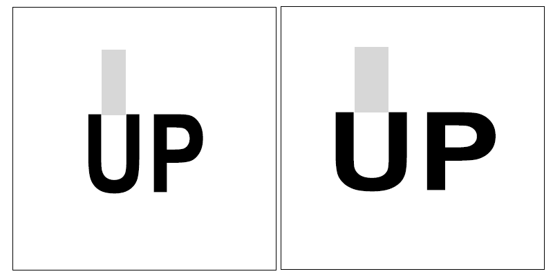
Letter Spacing Differences
Graphics programs often put irregular (different) spacing between letters. In some situations this can be a problem, making the design look unbalanced. To fix this change the letter spacing between individual letters so they have consistent volume between them. Note the example below the first is the default text as placed by the graphics program. The second is the altered text with similar volumes.
Colour Theory
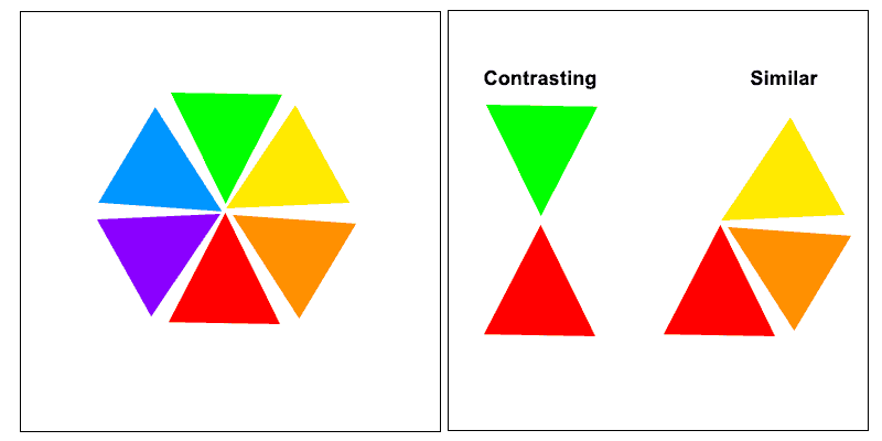
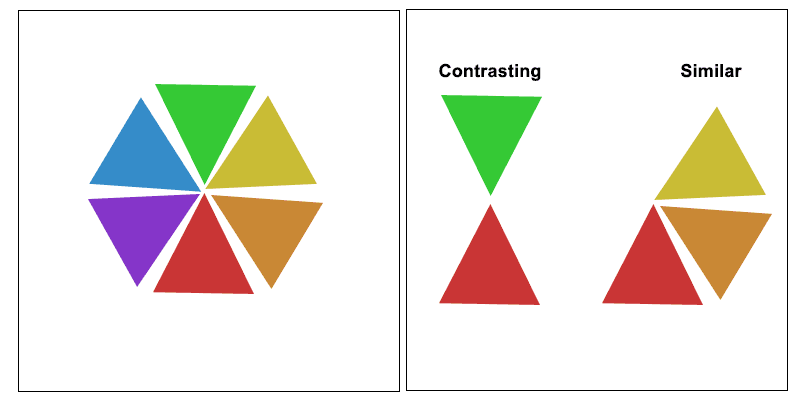
The Colour Wheel
Colour theory revolves around the colour wheel. The colour wheel is a circle with red, yellow, and blue being the primary colours, or the base for all other colours. If you look at the wheel below you will see in-between the blue, yellow, and red, are a mix of the two primary colours. Red and Yellow making orange. Blue and yellow making green. There are two things to notice here:
Colours Beside Each Other look similar to each other so make a good colour combination, they look good together in a design.
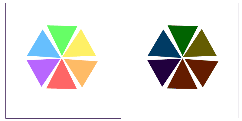
Colours Opposite Each Other contrast or stand out against each other, they are also good together in a design. But the two colours in a way fight against one another, they make each other stand out more. In fact if you look closely they appear to form a black line between each other. If you look at the two colour wheels below you will see the second one is less saturated, has less raw colour. It is clear that the colours on the less saturated wheel look better together. This technique is a key to working with colours that look bad together. Take bright red and green as an example often used at Christmas, it seems way too strong and contrasting, looking awful together, but if we make it less saturated, it actually looks OK together.
A key to selecting colours that look good with each other is to select them at equal intervals around the wheel, i.e. if in thirds, have Equal distance between the three.
Gray Scale added to Colour
Another colour combinations that looks good together is to add Grey to the colour you are using and use parts out of the gradient that is formed.
Gradient
Another way to get a good colour combination is to use a gradient. Select your two colours, then make a gradient between them. Select the middle colour, or colour at equal intervals, and you will have colours that look nice together.
More White or Black Added
Another way to make good colour choices is to use all the principal above but just add more white to the colour (to give a freshness to the colour), or add more black to give sinister tones. Think of a dark night it is scarier, than a bright sunny day. Colour gets feeling by adding brightness or darkness too. The feeling may not be the emotions of fear, and happiness, it could be anything just experiment and see how it feels.
Subtraction
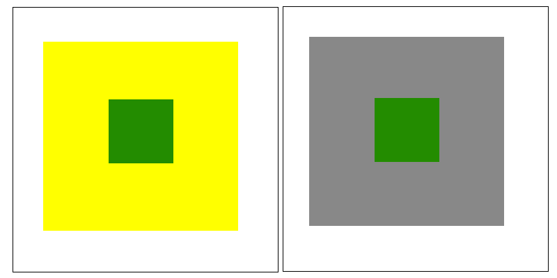
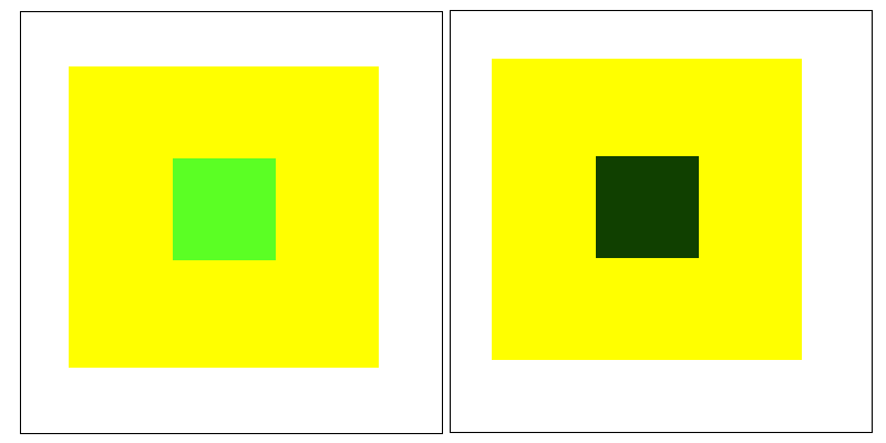
If you take a quick glance at the green dots in the image below you will notice they look slightly different in colour. The reason is that the surrounding colour subtracts colour from the inner dot. The way to describe it is that if a green dot of colour is surrounded by yellow (as an example), the middle dot will appear to have less yellow, so (being originally made of yellow and blue) it will appear very slightly more blue (because yellow has been subtracted). Because green is made up of blue and yellow, when you subtract yellow you get more blue. You can use formulas for this, the previous examples formula would be: B = (B+Y) - Y , that says the colour looks more blue (B), because yellow (Y) has been subtracted from the green (B+Y)
Size and Colour
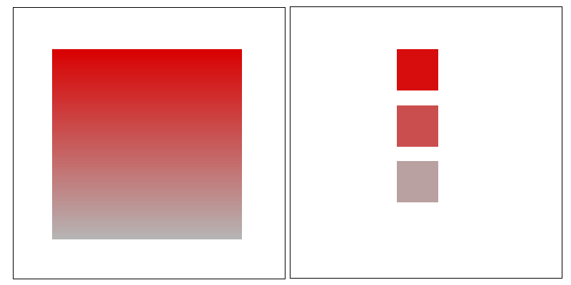
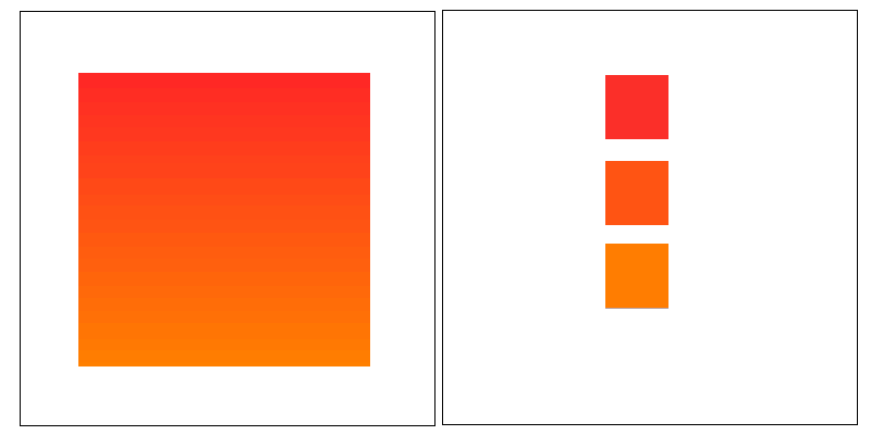
Deeper (darker) more saturated colours appear larger than lighter less saturated colours. See how the boxes below look different in size even though they use the same sized box.
Training By AI
Certainly! Color theory is a fundamental aspect of graphic design that involves understanding how colors interact, evoke emotions, and communicate messages effectively. In graphic design, there are several primary methods used in color theory:
1. Color Wheel: The color wheel is a visual representation of the relationships between colors. It organizes colors into primary, secondary, and tertiary colors, as well as warm and cool colors. The primary colors (red, blue, and yellow) are the building blocks of all other colors. Secondary colors (orange, green, and purple) are created by mixing two primary colors. Tertiary colors are created by mixing a primary color with a secondary color. The color wheel helps designers understand color relationships, such as complementary, analogous, and triadic color schemes.
2. Color Harmony: Color harmony refers to the pleasing arrangement of colors within a composition. Different color harmonies evoke different emotions and moods. Some common color harmonies include:
- Complementary: Colors that are opposite each other on the color wheel, such as red and green or blue and orange. Complementary colors create contrast and make each other appear more vibrant.
- Analogous: Colors that are adjacent to each other on the color wheel, such as blue, green, and teal. Analogous colors create a sense of harmony and cohesion.
- Triadic: Colors that are evenly spaced around the color wheel, such as red, yellow, and blue. Triadic color schemes create a balanced and dynamic composition.
3. Color Psychology: Color psychology explores the psychological effects of colors on human behavior and emotions. Different colors evoke different emotional responses and associations. For example, red is often associated with passion, energy, and urgency, while blue is associated with calmness, trust, and professionalism. Understanding color psychology helps designers choose colors that align with the intended message or brand personality.
4. Color Mixing: Color mixing refers to the process of combining different colors to create new colors. In traditional media, colors are mixed using paints or pigments. In digital design, colors are mixed using additive (light-based) or subtractive (pigment-based) color models. Understanding color mixing helps designers create custom color palettes and achieve desired color effects in their designs.
5. Color Contrast: Color contrast refers to the difference in brightness, hue, or saturation between colors. Contrast is used to create visual interest, hierarchy, and emphasis within a composition. There are several types of color contrast, including:
- Hue contrast: Contrast between different hues on the color wheel, such as red and green.
- Value contrast: Contrast between light and dark colors.
- Saturation contrast: Contrast between saturated and desaturated colors.
- Warm/cool contrast: Contrast between warm colors (e.g., red, orange, yellow) and cool colors (e.g., blue, green, purple).
By understanding and applying these primary methods of color theory, graphic designers can create visually compelling and effective designs that communicate messages clearly and evoke desired emotions in the viewer.
Squinting to See Composition
A technique used by designers to tell if a design is balanced, and looks good together is to squint, partially close your eyes, and look at the blurry version of the design that your eyes see. You will be able to pick up if it is balanced, and how the colours blur together.
Grids
Use a Grid
Placing an invisible grid in the background of an image/design helps to align elements in a logical way, so they have some order.
Horizontal Lines
Thick Horizontal lines at the top or bottom edge of a design make the contained content appear wider or more spacious. If there are no blocks at top or bottom the design will appear smaller, or constrained.
Vertical Lines
Thick vertical lines (up and down) can be used to hang other items off. If the vertical line is thick enough it will balance the other (hanging) items out.
Focus Through Break from Grid
In a rectangular grid design, try adding a circular or non grid shape to the grid for interest. It will create focus for the elements around it, drawing attention to them.
Training By AI
Grids are an essential tool in graphic design for organizing content, establishing consistency, and creating visually pleasing layouts. Here's how to effectively use grids in graphic design:
1. Structure and Organization: Grids provide a framework for organizing content within a design. They divide the layout into columns, rows, and modules, creating a structured and orderly arrangement of elements. By aligning elements to the grid, designers create a sense of order and hierarchy, making the design easier to navigate and understand.
2. Consistency and Harmony: Grids help maintain consistency and harmony throughout a design. By adhering to a consistent grid system, designers ensure that elements are positioned and spaced uniformly across different pages or screens within a project. Consistency in layout helps reinforce the brand identity and creates a cohesive visual experience for the viewer.
3. Alignment and Proximity: Grids facilitate precise alignment and proximity of elements within a composition. Elements can be aligned along common axes or edges, creating a sense of order and visual unity. Proximity of related elements within the grid helps establish relationships between them and communicates hierarchy and importance.
4. Flexibility and Adaptability: Grids provide a flexible framework that can adapt to different content and design requirements. Designers can adjust the grid structure, such as the number of columns or the spacing between modules, to accommodate varying amounts of content or different design styles. Grids can also be responsive, allowing designs to adapt to different screen sizes and devices.
5. Visual Rhythm and Flow: Grids help create visual rhythm and flow within a design by establishing consistent patterns and relationships between elements. By aligning elements along the grid and maintaining consistent spacing, designers guide the viewer's eye through the composition in a logical and intuitive manner. Visual rhythm enhances readability and engagement, making the design more appealing and enjoyable to interact with.
6. Modularity and Scalability: Grids promote modularity and scalability in design. Design elements, such as text blocks, images, or buttons, can be designed as modules that fit within the grid structure. These modular components can be easily rearranged or scaled to accommodate different content or design variations, streamlining the design process and ensuring consistency across different contexts.
7. Grid Types: There are various types of grids that designers can use, including:
- Column grids: Divides the layout into columns of equal width, providing a flexible structure for organizing content horizontally.
- Modular grids: Divides the layout into modules of equal size, allowing for precise placement and alignment of elements.
- Baseline grids: Aligns text and other elements to a baseline, ensuring consistent vertical spacing and alignment.
- Hierarchical grids: Combines multiple grid systems to accommodate different types of content or design elements within the same layout.
Overall, grids are a powerful tool in graphic design for creating organized, consistent, and visually appealing layouts. By using grids effectively, designers can streamline the design process, improve readability and navigation, and create designs that are both functional and aesthetically pleasing.
Psychology
Shape Fear
Sharp shapes trigger dangerous emotions in us, think of safe and unsafe in nature. Pointy things look dangerous.
Triggering Thought Processes
Different images/designs can invoke different thought pathways. A researched example is, a study was done where an image of eyes (watching) people was placed at a counter where donations were being taken, it was found that when people saw the image of the eyes they internally were more fearful that someone is watching them, so they are more likely to give, than if a generic image was displayed. Other examples are, to Chinese black and white represents death, so may be considered bad for a design sent to China. Be aware of culture and people perception of colour etc.
Happy Disorder
Images that are slightly off center, not symmetrical, viewed in perspective, are more appealing than ones aligned in a straight lines.
Rule of Thirds
If you break an image into thirds, objects positioned on the intersecting lines, are generally perceived well.
Curves and Human Form
Smooth shapes are more appealing to the eye than symmetrical ones, also shapes that mimic human form are perceived as more appealing than rigid shapes. Think of the iconic coke bottle, it has a human like shape. On the topic of human form, when modeling people for designs if they are too human like they are perceived less favorably than stylistic representations. Stylistic representations are preferred.
Don't Fill a Design
Although people have a tenancy to fill every bit of white space, it is bad for design, people actually perceive spacious designs as higher in quality. Less is best.
Escape Artist
In line with the principal above of not filling a design, you should have some areas in the design that the person can esacpe to. The eye if feeling uncomfortable with an image or concept needs some where to rest. It is similar to needing to look away in uncomfortable situations. Doing this helps make a design more restful.
Applying this concept to action, could involve adding an image to a large block of text, so when the person gets bored they have something to look at. Or it could be leaving some free space in a design to the person can escape from visual elements.
Golden Shapes
There is a ratio perceived to be golden, or special, as seen in nature, it is a ratio of 0.618. If one side was 100cm, the other side should be 61.8cm. Fibonacci sequences are also perceived favorably, i.e. 1 2 3 5 8 etc. Where the first number is added to the second.
Training By AI
Psychological methods in graphic design involve leveraging principles from psychology to influence perception, cognition, and behavior in viewers. These methods help designers create designs that are not only visually appealing but also effective in communicating messages and achieving desired outcomes. Here are some of the main psychological methods used in graphic design:
1. Color Psychology: Color psychology explores how different colors affect emotions, perceptions, and behaviors. By understanding the psychological associations and cultural meanings of colors, designers can strategically use color to evoke specific moods, convey messages, and influence viewer responses. For example, warm colors like red and orange are often associated with energy and excitement, while cool colors like blue and green are associated with calmness and relaxation.
2. Gestalt Principles: Gestalt psychology emphasizes how humans perceive and organize visual information into meaningful patterns and structures. Designers use Gestalt principles such as proximity, similarity, closure, continuity, and figure-ground relationship to create designs that are easy to understand and visually coherent. By applying these principles, designers can guide the viewer's attention, create visual hierarchy, and enhance the overall readability and comprehension of the design.
3. Typography and Readability: Typography plays a crucial role in shaping how information is perceived and understood. Different typefaces, font sizes, weights, and styles can convey different emotions, personalities, and levels of formality. Designers use typographic principles such as legibility, readability, and hierarchy to ensure that text is easy to read and comprehend. By choosing appropriate typefaces and formatting text effectively, designers can enhance the overall user experience and make the content more engaging and accessible.
4. Visual Perception: Visual perception refers to how humans interpret and make sense of visual stimuli. Designers leverage principles of visual perception, such as contrast, symmetry, balance, and focal points, to create designs that capture attention and communicate messages effectively. For example, using high-contrast colors or bold typography can make key elements stand out and draw attention, while symmetrical layouts can create a sense of order and stability.
5. Emotional Design: Emotional design focuses on creating designs that evoke specific emotional responses in viewers. By incorporating elements such as imagery, color, typography, and storytelling, designers can elicit emotions such as joy, surprise, nostalgia, or trust. Emotional design helps create memorable and engaging experiences that resonate with viewers on a deeper level and foster positive associations with brands or products.
6. Cognitive Load and User Experience: Cognitive load refers to the amount of mental effort required to process information. Designers aim to minimize cognitive load and create designs that are intuitive and easy to use. By simplifying complex information, providing clear navigation cues, and reducing distractions, designers can enhance the user experience and improve usability. Understanding principles of cognitive psychology helps designers create designs that are user-friendly, efficient, and enjoyable to interact with.
Overall, psychological methods in graphic design provide valuable insights into how humans perceive and interact with visual stimuli. By applying principles from psychology, designers can create designs that are not only visually appealing but also effective in communicating messages, shaping perceptions, and influencing behavior.
The Gestalt Principles
The Gestalt Principles are a set of psychological principles that describe how humans perceive and interpret visual elements as organized wholes, rather than individual parts. These principles provide valuable insights into how viewers perceive and make sense of visual information, and they are widely used in graphic design to create designs that are cohesive, organized, and visually appealing. Here are some of the key Gestalt Principles and how they are applied in graphic design:
1. Proximity: The principle of proximity states that elements that are close to each other are perceived as belonging together. In graphic design, designers use proximity to visually group related elements and create a sense of unity. By placing elements close to each other, designers indicate that they are part of the same group or category, making the layout easier to navigate and understand.
2. Similarity: The principle of similarity states that elements that are similar in shape, size, color, or texture are perceived as belonging together. In graphic design, designers use similarity to create visual patterns and establish relationships between elements. By using consistent visual styles, such as using the same color or typeface for related elements, designers can create a cohesive and harmonious design that is easy to understand and navigate.
3. Closure: The principle of closure states that viewers tend to perceive incomplete or fragmented visual elements as complete shapes or objects. In graphic design, designers use closure to create implied shapes or forms, allowing viewers to fill in the gaps and perceive the whole picture. By strategically placing elements and leaving gaps or negative space, designers can create designs that are visually interesting and engaging.
4. Continuity: The principle of continuity states that viewers tend to perceive continuous and uninterrupted lines or patterns as belonging together. In graphic design, designers use continuity to create visual flow and guide the viewer's eye through the composition. By aligning elements along common axes or edges, designers create a sense of order and organization that enhances readability and comprehension.
5. Figure-Ground Relationship: The principle of figure-ground relationship states that viewers tend to perceive objects as either figures (foreground) or ground (background) based on their contrast and relative prominence. In graphic design, designers use figure-ground relationship to create emphasis and hierarchy. By contrasting elements against their background, designers can make key elements stand out and draw attention, while allowing other elements to recede into the background.
By applying these Gestalt Principles in graphic design, designers can create designs that are visually coherent, organized, and easy to understand. Whether it's grouping related elements using proximity, creating visual patterns using similarity, or guiding the viewer's eye through the composition using continuity, Gestalt Principles provide valuable guidelines for creating effective and engaging designs.

God Works @ work I remember being at church last week and chatting to a friend about how I got into Website design. All the praise goes to Jesus. I used to work many hard manual labor jobs, not that there is anything wrong with that. But I hated the work, I would find myself out in the hot sun, wanting to curse and swear. One day I was driving past Griffith University Campus and saw all the students walking past, and wished I could go there. So I prayed and said to God, "Why do I have all the rotten luck, could you not get me there".
Time went by and I forgot about the prayer. Then some years latter I did a TAFE preparation course to go to university. I applied for many universities, but was accepted by Griffith University to do a Teaching Degree, the very uni I had past as I prayed. God was good to me, I swapped to a Degree in Computer Programming, and have not looked back. The work is great, and I now have a praise to God for my work rather than a curse in my heart. No matter where we are in life, God can promote us, and take us to places we never expected.
 Guardian Online Development